Getting Started with Responsive Design for Events
What's "responsive design" anyway?
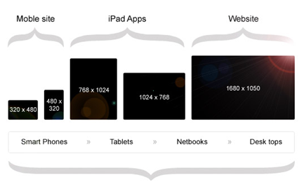
Responsive web design is a way of building your website so site visitors—regardless of how they're viewing your site—aren't required to re-size windows, scroll excessively, or pan across the page to view content. Responsive web pages look at home on desktops, smart phones, smart TVs, or any other Internet-enabled device.
Still not clear? Check out this video and this blog post for more detail.
Why start planning for a responsive site design now?
Mobile browsing isn't a slowly emerging phenomenon—it's already here, and its share of Internet traffic gets bigger every day. In 2013, Internet usage on mobile devices is projected to surpass desktop usage, and experts expect mobile Internet use to rise sharply for at least the next 5 years. Now's the time to think about implementing a responsive site design and consider how this new paradigm will affect your event plans.
Did you know:
- Mobile usage is expected to exceed desktop usage by the end of 2013. Tablet sales alone are expected to surpass desktop and laptop sales by 2015.
- 17% of cell phone owners—that's nearly 34 million adults—do most of their online browsing on their phone.
- 90% of our media interactions are screen-based, and 38% on smart phones.
- Google now recommends responsive design as an industry best practice
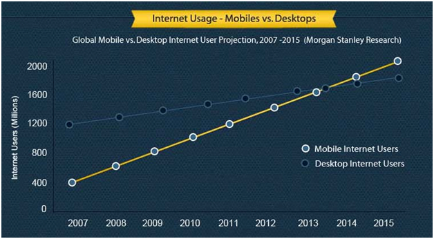
Study by Morgan Stanley. Infographic by dotcominfoway.
3 Ways to Get Started with Responsive Design in Luminate Online
Level 1: Review your data and turn on Luminate features
1. Determine how much mobile traffic your site already receives. This can help you decide how soon you should start implementing a responsive design (e.g., if you're already getting a lot of mobile visitors, you'll want to start sooner than later). Luckily, if you have Google Analytics tracking enabled on your site, you've automatically been collecting this data. Here's how to find it:

- Log in to Google Analytics
- Click on the website you want to view data on.
- Under Audience click on Mobile > Overview
- (Optional) Drill down by device by choosing Mobile > Devices (helps to determine breakpoints)
Here's an example: take a look at the Google Analytics stats for the Luminate Customer Center to the right. Currently, mobile devices comprise a pretty small share of our overall traffic, which is why we've yet to implement a responsive design. We expect these ratios to continue shifting in favor of mobile, though, which is why we're already developing an action plan.
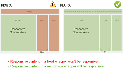
2. Start using the new responsive donation form and registration layout in Luminate Online. If these layouts aren't in a responsive PageWrapper, they won't automatically resize according to screen size, but it'll still give your staff and constituents more time to get used to the new layout. This way, when you do add a responsive wrapper, it won't be as dramatic a change.
Note: If your TeamRaiser event was created before January 2013, you'll need to recreate it instead of copying or cloning an old version.
Level 2: Enable a simplified responsive wrapper
1. If you're ready to implement a completely responsive registration or donation process, you'll need to create a responsive PageWrapper. A responsive PageWrapper will allow the frame around each page's content to shift and change along with it. Fair warning: this can be a time-consuming project, whether for your entire site or just your event page(s). If you're ready to take on a full redesign, skip this section and go straight to Level 3 below.
2. Implement a simplified wrapper around one specific donation form OR just your event registration workflow. By limiting yourself to just a few navigation items and pictures, you'll be able to create and implement it much faster. We've even built a TeamRaiser Responsive PageWrapper Kit to help you kick things off.
Level 3: Full responsive site rebuild or redesign
When you're ready to do a complete site rebuild or redesign, you'll need a series of specialists (information architects, desingers, and developers) working together to craft the best experience.
Site rebuilds typically involve working with one of our information architects to re-work your existing site design into a responsive framework. After that's done, a developer will re-code the site accordingly and test the work across multiple device resolutions and browsers to ensure consistency.
Site redesigns are similar to rebuilds, but with one key difference: instead of simply re-working your existing site design and architecture, we'll build a completely new site—design and all—from the ground up. As you'd expect, these projects take longer: the added design steps, wireframes, and rounds of revisions all take extra time.
We have teams at Blackbaud that can help you architect the right solution for your organization and build a bespoke solution from the ground up. Just give your Client Success Manager a call and they can help you explore your options.
Want to learn more about responsive design? Check out the additional resources below.
Services
We have a large services team that includes information architects, consultants, designers, and web developers. Whether you need help simply crafting a responsive design strategy or actually doing the work, we've got your back. Contact your CSM if your're interested in any of these services:
- Responsive adaptation of your current site or event PageWrapper design
- New Responsive PageWrapper design from scratch - Luminate Online or CMS
- Responsive PageWrapper implementation of any responsive design
- Responsive Kit Implementation (If you don't want to do it yourself)
Videos
Reports
Kits
Release/Platform Information
Privacy Policy | Safe Harbor Notice | Terms of Use | Acceptable Use Policy | © 2012 Blackbaud, Inc. All Rights Reserved